Simple prompts are the standard benchmarking currency i.e. easy to reproduce, easy to score. I wanted to try something different: what if the benchmark was a proper spec?
A while back I wrote about building a retrospective board in under an hour using spec-driven development. This time I took the same OpenSpec and ran it 90 times across different models, agents, and configurations, with identical configurations repeated several times, to see what varied their implementation and why. The spec covered creating a collaborative retrospective board with a React frontend, Node.js backend, WebSockets, SQLite, Docker, drag-and-drop, nested comments, and CSV export.
However, I deliberately left out any visual design guidelines and verification instructions. I wanted to see what choices different models and agents would make on their own. Some results were expected. Others were not.
Every run was scored on the same 14 functional criteria. A criterion earns 3 if it worked on the first try, 2 if it failed and was fixed after one corrective prompt, and 1 if it never fully worked. The maximum is 42. Note that this makes the total forgiving. A run that fails and gets repaired keeps most of the credit, which matters later.
The full results are documented at Realtime Retro Board, Model Comparison Report.
Code: achintmehta/retrospective-board-eval.
Observation 1: Same model, Different agent, Completely different UI
I ran Claude Opus 4.6 through both Claude Code and Antigravity. Same model, same spec, same effort level.
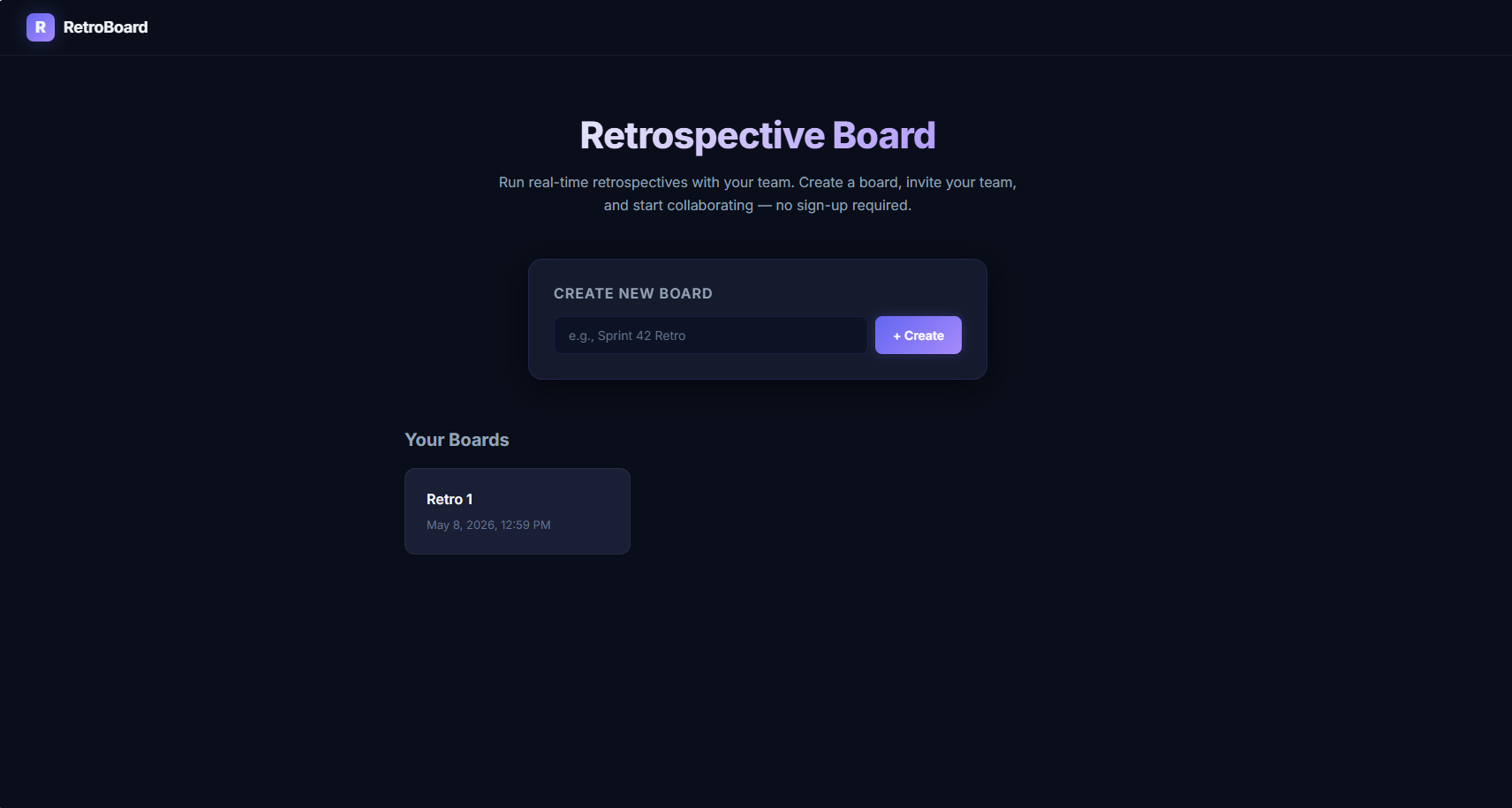
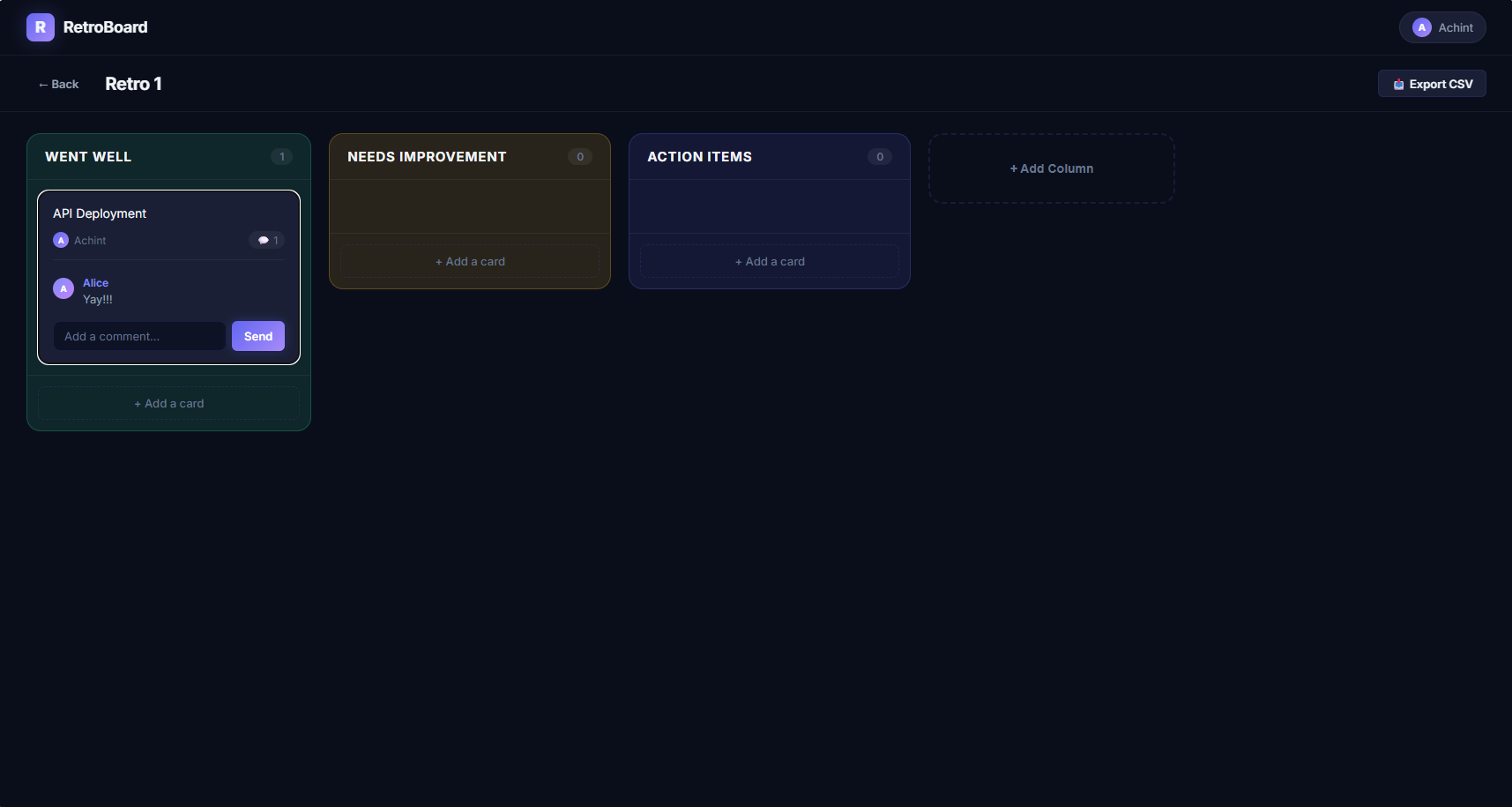
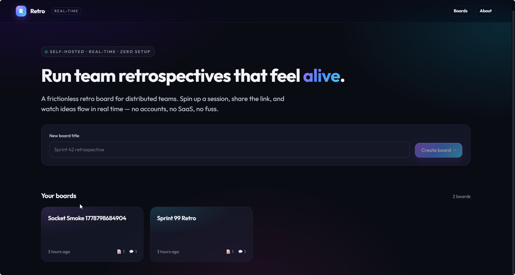
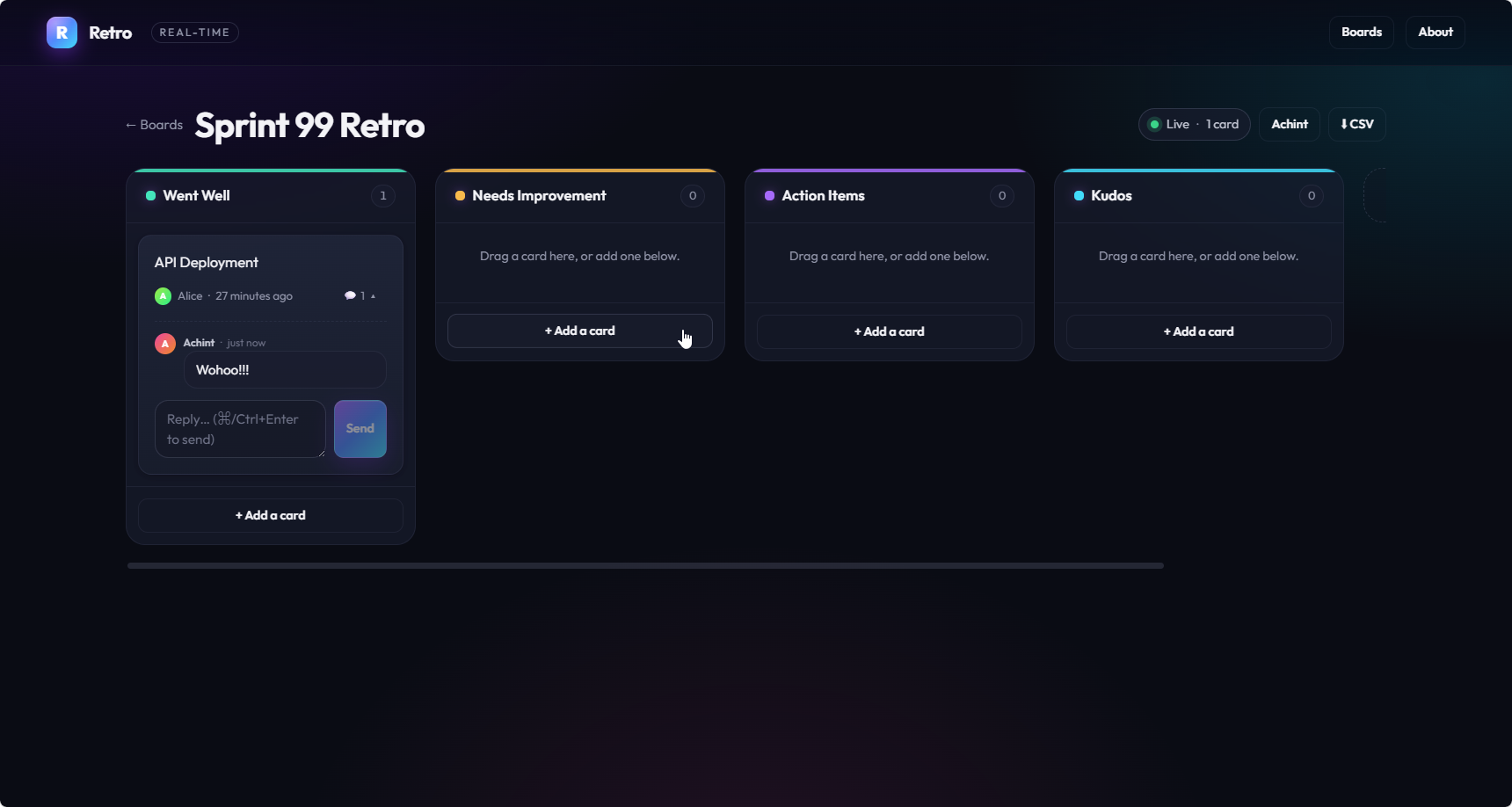
Antigravity produced a noticeably different result with a dark theme, colour-coded columns, avatar chips, and branded navbar. Claude Code was clean and functional but plain.
Antigravity with Opus 4.6:
Same Opus 4.6 model, Claude Code, no system prompt customization:
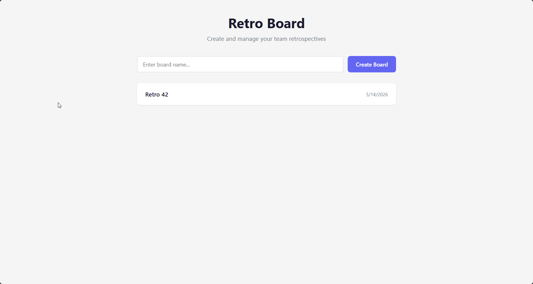
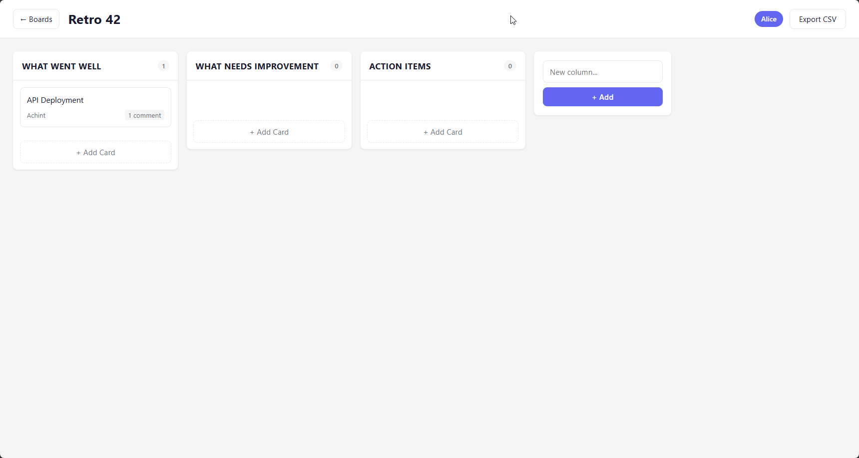
Antigravity doesn't talk to the model or call Anthropic APIs directly. Instead, it communicates with its Vertex AI backend which in turn communicates with Anthropic's APIs. This Vertex AI injects its own system prompt regardless of whether you provide one. That prompt contains explicit visual design instructions: rich aesthetics, dark modes, modern typography, micro-animations. It tells the model that a plain-looking result is unacceptable.
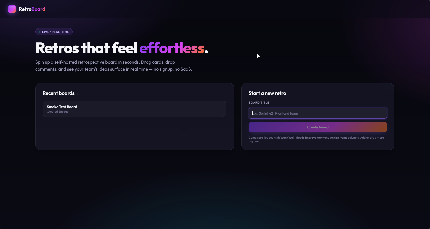
Once I supplied that prompt to my Claude Code runs as project instructions, the polish followed the prompt. Across all 90 runs, the 40 runs that received a design prompt averaged between 4.5 and 4.7 out of 5 on visual quality. Every Claude Code run without one was rated exactly 3.0, no matter the model, the effort level, or the tools available. Opus 4.7 with the prompt produced marketing-style landing pages with custom product names and gradient headlines, and scored 5/5:
Agents are not neutral wrappers. The scaffolding around a model shapes its output just as much as the model itself.
Observation 2: One paragraph of prompt buys all the polish
The Antigravity prompt is long and insistent, so I wanted to know whether the length and the emphatic tone were doing the work. To test that, I wrote a one-paragraph paraphrase of just its design directive and ran 18 additional runs with it:
Treat visual quality as a first-class priority for any user interface you build. The result should feel premium, modern, and polished at first glance, never plain or minimal. Use a curated, harmonious color palette instead of generic default colors. Sleek dark themes are welcome. Use modern typography (for example a Google font such as Inter or Outfit) instead of browser defaults. Use smooth gradients and subtle micro-animations, and add hover effects so the interface feels responsive and alive. Do not ship a design that looks like a simple minimum viable product.
That paragraph reproduced the entire lift. The abridged runs averaged 4.7 out of 5 against 4.5 for the full prompt, and the two were visually indistinguishable:
The capacity to produce a polished interface was in the model all along. It is just not expressed unless you explicitly ask for it, and the ask needs neither length nor emphasis.
There is a catch, though. The polish is priced in reliability as well as tokens. Design-prompted runs missed the drag-and-drop criterion on the first try far more often than base runs, 11 of 40 against 5 of 45, and the only two xHigh sweep runs that were not perfect first try were design prompt runs that missed exactly that criterion. In one abridged run the agent's own diagnosis traced a broken drag and a blurred comment panel to a backdrop-filter blur it had added for visual depth. The more ambitious interface carries richer interaction code that is easier to get subtly wrong.
Observation 3: The testing tool added cost, not reliability
This was the result I found most surprising.
I ran matched sets of Opus 4.7 runs with the Playwright screenshot-testing tool enabled and without it, six replicates per cell, at both High and xHigh effort. The functional score did not move. The cost did: the median session cost rose 42% at High effort and 68% at xHigh. An earlier seven-versus-seven contrast on Opus 4.6 showed the same pattern, identical mean score with a 27% cost premium. And this is not a case of the tool sitting idle, because every tool-enabled run demonstrably invoked it.
The session token records show where the premium went:
| Opus 4.7 (medians) | Score | Cost | Output tokens | Cache-read tokens |
|---|---|---|---|---|
| High, base | 41 | $3.06 | 46k | 2.3M |
| High, +Playwright | 41.5 | $4.34 | 42k | 5.3M |
| xHigh, base | 42 | $3.33 | 45k | 2.3M |
| xHigh, +Playwright | 42 | $5.59 | 51k | 7.0M |
Output tokens barely move. Cache reads double or triple. The tool premium is context re-reading, the model repeatedly re-ingesting a session inflated by tool roundtrips and screenshots, not additional engineering output.
The deeper reason the tool could not help is that the failures were mostly in places a screenshot cannot see. Docker deployment failed on the first attempt in 44% of all runs, and the local dev environment in another 17%. Together the two environment criteria account for 55% of every first-try failure in the dataset. The recurring culprits were a native SQLite module that does not compile in a minimal container and a breaking change in Express 5 that removed a wildcard route. When the build itself fails, there is no interface to test. Architecture Without Architects (2025) found exactly this pattern: agents actively make architectural choices in ways that are not always visible to the developer, and more feedback mechanisms do not automatically mean better design decisions.
The practical takeaway: match the tool to the failure mode. A container build check might have caught these faults. A tool aimed at the rendered page could not, and it billed for the attempt anyway.
Observation 4: Reasoning effort buys first-try reliability
The reliability the tool did not deliver was available from a different knob. Because a repaired criterion still earns 2 of 3 points, the totals hide how often a run was perfect unaided. Pulling that out changes the picture:
| Opus 4.7 cell | Mean score | First-try 42/42 | Cost (median) | Aesthetics /5 |
|---|---|---|---|---|
| High, base | 41.0 | 2/6 | $3.06 | 3.0 |
| High, +Playwright | 41.5 | 3/6 | $4.34 | 3.0 |
| High, +design prompt | 40.5 | 0/6 | $4.28 | 4.8 |
| xHigh, base | 42.0 | 6/6 | $3.33 | 3.0 |
| xHigh, +Playwright | 42.0 | 6/6 | $5.59 | 3.0 |
| xHigh, +design prompt | 41.5 | 4/6 | $5.17 | 4.8 |
Raising effort from High to xHigh lifted first-try-perfect runs from 28% to 89% and cut corrective prompts about five-fold, for roughly 9 to 29% more cost. The screenshot tool moves cost. The design prompt moves aesthetics. Effort is what moves reliability.
Effort also compresses variance. Identical configurations do not produce identical software: across seven repeated Opus 4.6 runs at High effort, hand-written CSS ranged from 41 to 626 lines, a fifteen-fold spread, with scores scattering from 38 to 42. At xHigh the functional scatter collapses to a near-uniform 42. You cannot dial this down with sampling parameters either, since current frontier models pin or reject non-default temperature settings, so effort is the lever that remains. Any single agent output is one sample from a wide distribution, not a representative result.
What the experiment showed overall
Capability tier dominates everything else. The three frontier Claude families all cluster near the 42-point ceiling with means around 41, across a cost range of roughly $1 to $8 per run. The cheapest perfect run was Sonnet 4.6 at High effort, 42/42 for $1.08. Qwen Coder Next scored 24/42 at $178.88 in Claude orchestration overhead, which says something blunt about the cost-quality relationship in agentic coding. No tool, prompt, or effort setting moved scores within a tier by more than a point or two, but those compressed totals conceal large differences in first-try reliability, which is where the real cost of an agent lives.
The more durable findings are the four above. Agents are not neutral. Capability for polish is present but must be invoked. More capability available to the model does not automatically produce better software, and a verification tool cannot fix failures it cannot see. The spec is the thing that most determines the output, and an underspecified one gets filled by defaults that vary enormously and are often invisible. The more deliberate you are before you start, the less of that gap there is to fill.